

NYFW happens twice a year and happens to be one of the biggest events that take place in the fashion world. With all that goes on, it can definitely be difficult to catch every show. But that’s why we’re here to help. Here’s a little recap of what took place at June79 Summer/Fall 22 NYFW runway show.
In true NYFW fashion form, the June79 show was definitely unique. Picture this: you’re walking up to what you think might be a regular simple runway show. Instead, you end up in a sort of 60s-70s style restaurant. However, it’s not cheesy, it’s actually quite tasteful. The booths are red, the floors are white, and the walls are glossy black. Black and white photos of celebrities line the walls. And of course, the anticipation in the air is strong. As everyone was being seated, the same look crossed everyone’s face. “What is going on?” But not in a negative way, more of just wondering what was to come. And with that, the music from the “Devil Wears Prada” plays as the first model walks out.
With bold prints, bright colors, and a little mix of upscale streetwear, June79’s collection was definitely summer-ready. Despite being a summer/fall collection, a lot of these pieces could be passed from season to season.

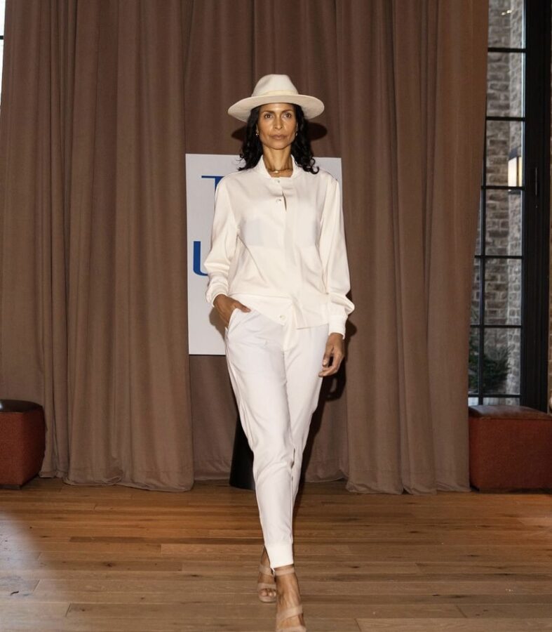
The first look was super chic and classy. Although, June79 defines their brand as menswear, it was a nice surprise to see a woman start off the show in this cream look. With the cream top hat, it was definitely giving brunch/boss moves vibes.

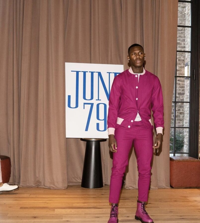
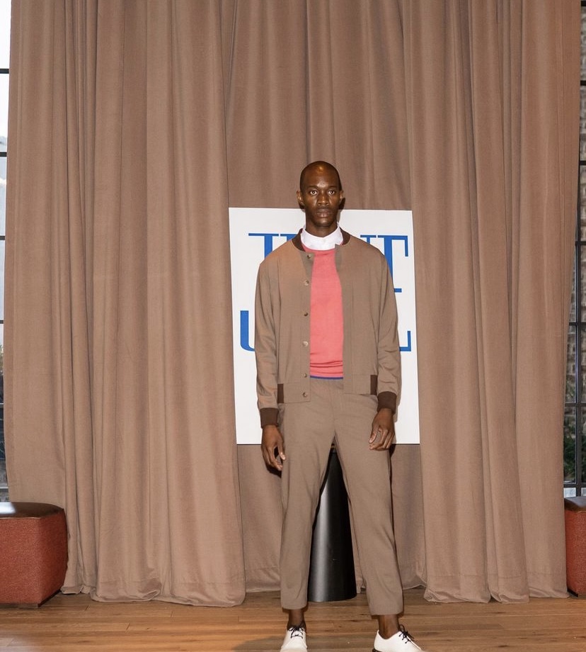
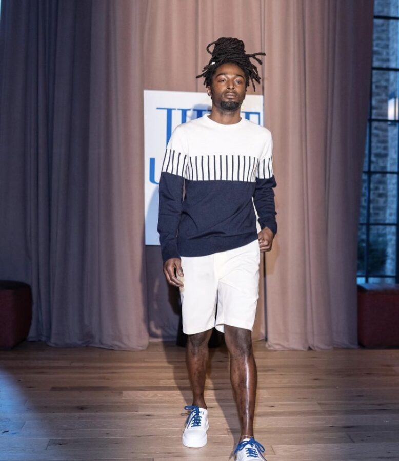
In look two it’s always refreshing to see a man pop out in color, this look was really fun and bright. June79 was able to capture the feel of this look so effortlessly. From the mixing of the pinks to the way outfit was paired, this look definitely can be worn during any occasion.

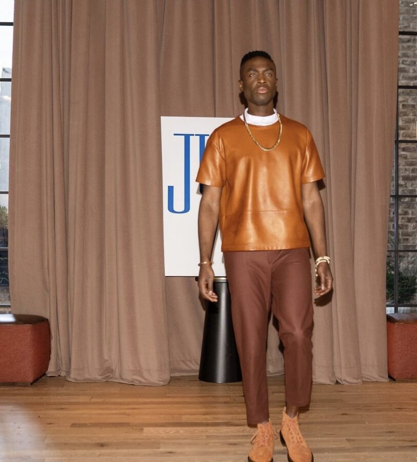
In addition to the bold prints and bright colors, the use of color blocking was perfectly incorporated into this collection. What was so unique about look 3 was the mixing of the leather and linen fabrics. Even though the leather was bold, it was subtle enough to not be too overwhelming; it was the perfect pop that the outfit needed.

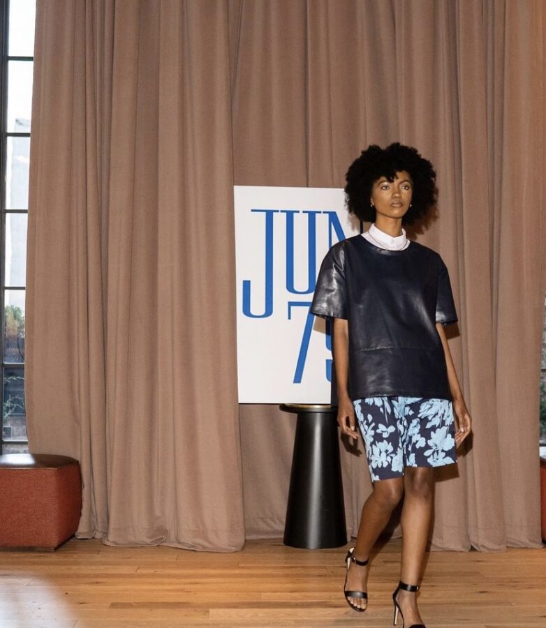
In regards to mixing fabric and prints, look 4 happened to be a personal favorite. With a bold flower print like this, it can be at times difficult to keep the outfit together, but paired with this tasteful leather top, the florals pull everything together effortlessly. It was the right amount of street fashion and class.

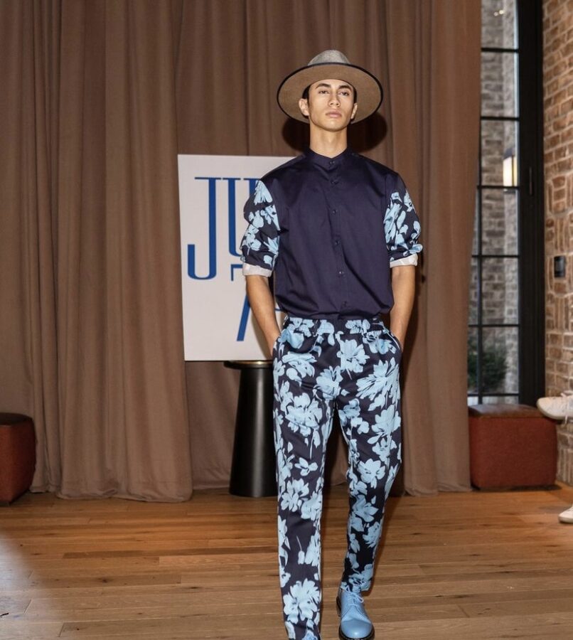
Sibling look 5 was just as put together as the last. Again June79 takes a bold fabric and mixes it with a subtle color have it not be too overwhelming but still stand out against everything else. This look is sure to turn heads!


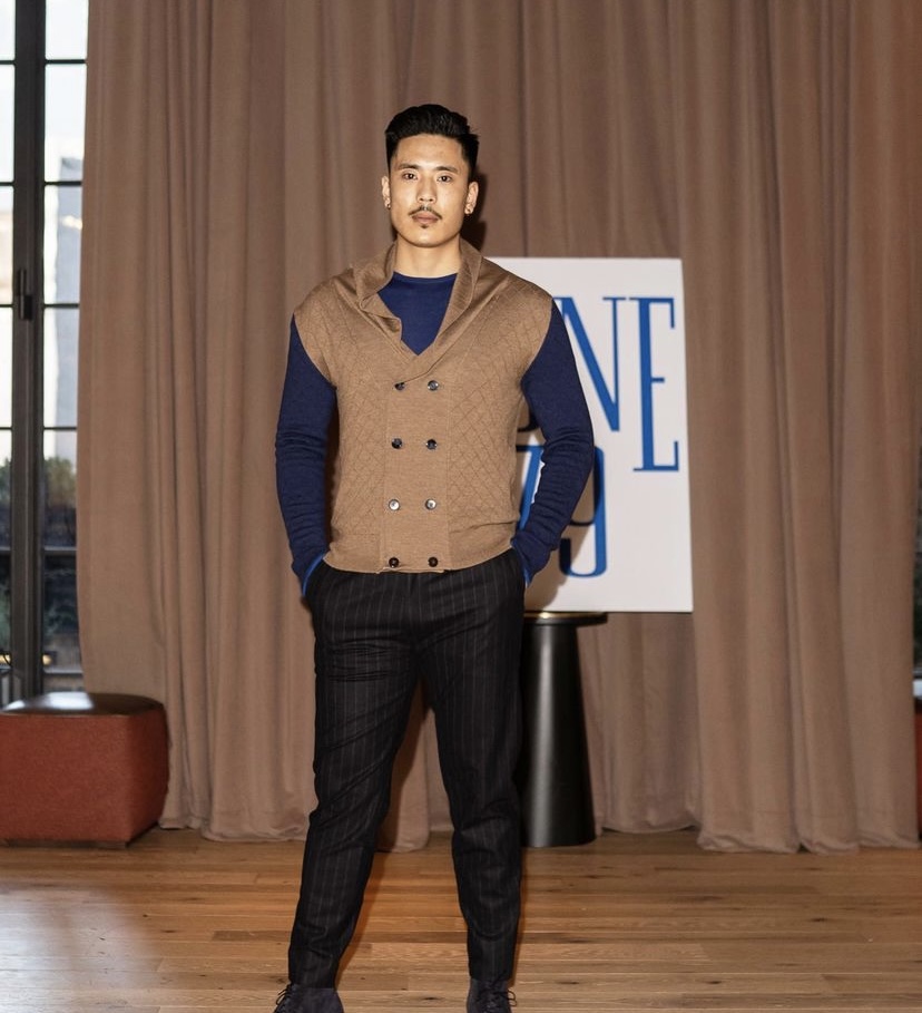
Looks 6 and 7 were specifically grouped together specifically to pay homage to June79’s classic look.Unlike the new collection that featured a lot of bold prints, the older styles played it a bit more safe.Despite playing it safe, it still wasn’t dull or boring. The mixing of colors is very pleasing to the eye and little hints of color blocking within the first jacket is chef’s kiss.

Throughout this collection, blue was heavily used. But what made it not seem repetitive was the manner in which it was translated. The prints were not the same and the outfits were set for different occasions. Look 8 was a perfect day to day look!

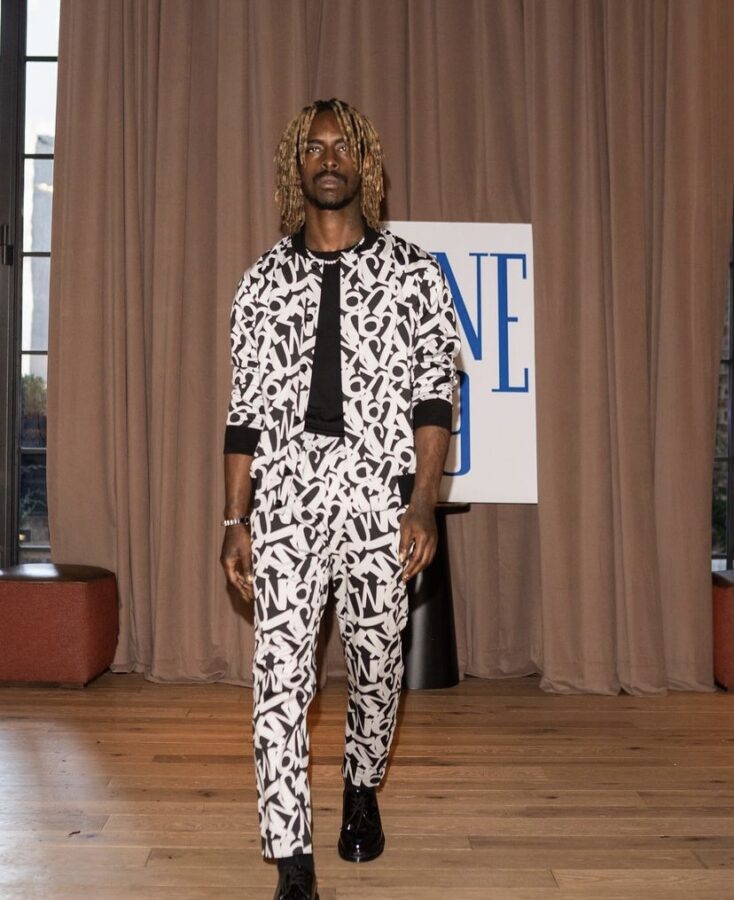
Again not shying away from being too bold, this last look was definitely every bit of street style. With the use of heavy logo print, you would think this may be too much. Instead, it was just the right look for the season. All in all creative director Sean Pean did an outstanding job with staying on-trend and mixing fabrics/prints. Even though this brand is heavily influenced by European culture, you could see every bit of New York flair peek out. It will be exciting to see the evolution of June79 as time goes on.
If you want to read more, follow MEFeater on Twitter, Instagram, Facebook, and Pinterest!